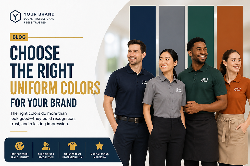
Choosing the Right Uniform Colors for Your Brand
- zooksteam
- May 2
- 8 min read

Before your employee says a single word to a customer, their uniform has already spoken. Here is what it might be saying — and how to make sure it is saying the right thing.
There is a moment that happens in every customer interaction — a split second before the handshake, before the greeting, before anything verbal passes between two people. In that moment, the human brain is already processing and making judgements.
Height. Posture. Expression. And color.
Color is not decoration. It is data. The human visual system processes color before it processes shape, before it processes text, and long before conscious thought catches up. For brands that dress their teams in uniforms, this is either an extraordinary opportunity or an invisible liability — depending on whether they have thought about it.
Most companies have not. They pick a uniform color because it matches the logo, or because it hides stains, or because someone in procurement liked it. And then they wonder why their brand feels inconsistent across locations, or why customers describe their staff as cold at one branch and approachable at another.
At Zooks, we manufacture bulk custom uniforms for companies across industries — corporate, hospitality, healthcare, retail, logistics. And one of the most underestimated conversations we have with clients is about color. This guide exists to make that conversation easier.
Why Color Actually Matters in Uniforms
Color psychology is a well-documented field. Studies across consumer behaviour, workplace environments, and brand perception consistently show that color influences mood, trust, perceived competence, and emotional response — often without the viewer being consciously aware of it.
In the context of uniforms, the implications are direct:
◆ A hotel front desk team in warm burgundy reads as luxurious and attentive.
◆ The same team in clinical white reads as cold or transactional.
◆ A retail sales associate in vibrant orange feels energetic and approachable.
◆ The same associate in dark grey feels authoritative but distant.
None of these perceptions are accidental. They are the result of deeply ingrained cultural and neurological associations — associations your uniform either works with or against.
Your uniform color is not just an aesthetic choice. It is a brand signal that fires in the customer's brain before your employee speaks.
A Color-by-Color Guide for Corporate Uniforms
Here is how the most common uniform colors are perceived — and which industries and brand personalities they are best suited for.
■ NAVY BLUE — Authority, trust, competence, reliability
Navy blue is the most universally trusted color in professional environments. It signals competence without aggression, and authority without intimidation. It is the color of boardrooms, banks, and airlines for a reason.
◆ Best for: Banking & finance, aviation, corporate offices, security services, logistics
◆ Avoid if: Your brand personality is playful, creative, or deliberately unconventional
◆ Pairs well with: White, light grey, silver accents
■ WHITE — Cleanliness, precision, professionalism, simplicity
White reads as clean, exact, and modern. In industries where hygiene and precision are the product — healthcare, labs, premium hospitality — white uniforms communicate that these things are taken seriously. Outside of those contexts, white can feel sterile or impersonal.
◆ Best for: Hospitals, clinics, fine dining, luxury retail, aesthetics and wellness
◆ Avoid if: Staff are in physical, outdoor, or high-contact roles
◆ Pairs well with: Navy, charcoal, pastel accents for warmth
■ BLACK — Sophistication, premium, confidence, exclusivity
Black is the color of premium. It signals that a brand takes itself seriously and does not need to shout. Black uniforms elevate the perceived price point of whatever service is being delivered. A server in a black uniform at a mid-range restaurant makes it feel like a premium experience.
◆ Best for: Fine dining, luxury hotels, high-end retail, event management, corporate leadership teams
◆ Avoid if: Your brand aims to feel warm, accessible, or community-oriented
◆ Pairs well with: White, gold, burgundy, or a strong brand accent color
■ RED & BURGUNDY — Energy, urgency, passion, confidence
Red is the most emotionally charged color in the spectrum. In uniforms, full red can feel aggressive if not balanced carefully — but deep reds and burgundy carry warmth, authority, and a sense of occasion. Think five-star hotels and heritage airline cabins.
◆ Best for: Hospitality, F&B, entertainment, fast-casual dining, sports teams, promotions
◆ Avoid if: Your industry requires calm, trust, or clinical precision (healthcare, finance)
◆ Pairs well with: Black, ivory, gold — not with other bright colors
■ GREEN — Health, nature, growth, calm, sustainability
Green's associations are positive and broad — health, freshness, sustainability, and calm. It is having a moment in India as eco-conscious brands, wellness companies, and organic food businesses use it to signal their values before saying a word.
◆ Best for: Healthcare, organic/natural food brands, wellness, sustainability-led D2C brands, outdoor and tourism
◆ Avoid if: Your brand is in finance, tech, or luxury — green can feel too casual in those contexts
◆ Pairs well with: White, beige, natural tones
■ GREY — Balance, neutrality, professionalism, intelligence
Grey is the thinking person's neutral. It avoids the stiffness of black while maintaining professionalism. In tech companies, consulting firms, and modern offices, grey uniforms communicate calm sophistication. The risk is that it can feel forgettable if not paired with a strong accent.
◆ Best for: Tech companies, consulting, modern co-working spaces, premium manufacturing
◆ Avoid if: You need high visibility or emotional engagement from your staff's appearance
◆ Pairs well with: Brand accent colors, white, navy
■ ORANGE & YELLOW — Energy, friendliness, optimism, visibility
High-energy colors that are impossible to ignore. Orange reads as friendly, enthusiastic, and approachable. Yellow is the color of caution and visibility — essential for safety roles. For consumer-facing brands that want to feel warm and high-energy, orange accents in uniforms are powerful.
◆ Best for: Retail, quick service restaurants, delivery staff, safety/industrial roles, fitness brands
◆ Avoid if: Your brand positioning is premium, formal, or sophisticated
◆ Pairs well with: Black, dark navy, white
Quick Reference: Industry to Color Mapping
Use this as a starting point when briefing your uniform order. The right answer for your brand may differ based on your specific brand personality — but this is where most successful uniform programs begin.
Industry | Recommended Colors | Colors to Avoid |
Corporate / Finance | Navy, Charcoal, White | Bright red, Orange |
Hospitality / Hotels | Black, Burgundy, Ivory, Navy | Neon, Camouflage |
Healthcare / Clinics | White, Teal, Pale Blue, Green | Black, Dark red |
Retail / F&B | Brand color, Orange, Red | Grey (can feel dull) |
Logistics / Field | Orange, Yellow, Olive, Navy | White, Light pastels |
Fitness / Gyms | Black, Red, Grey, Neon accent | Pale / washed tones |
Education / Training | Navy, White, Green | All-black (feels austere) |
The Three Rules of Uniform Color That Most Brands Get Wrong
Rule 1: Your uniform color and your brand color are not the same thing
This is the most common mistake. A startup with a bright yellow logo assumes their uniforms should be bright yellow. They order 200 yellow t-shirts. The result looks more like a school sports day than a professional company.
Your brand color is a graphic element. Your uniform color is a garment worn by a human being in three dimensions, under real-world lighting, against skin tones and environments. The two need to be coordinated — not identical.
A smarter approach: use your brand color as an accent — in the collar trim, the sleeve stripe, the embroidered logo, or the pocket detail — while building the uniform base in a more wearable, flattering neutral.
Rule 2: Consider the environment where the uniform will be worn
A color that looks sharp in a showroom can look sickly under fluorescent warehouse lighting. A crisp white uniform that works in a pristine hotel lobby becomes a liability in a busy kitchen or on a construction site.
Always evaluate your chosen uniform color under the actual lighting conditions where it will be worn. Natural daylight, warm incandescent, cool LED, and fluorescent all shift fabric colors differently. Request fabric swatches and test them on-site before placing a bulk order.
Rule 3: Skin tone and color contrast matter
India's workforce is beautifully diverse in skin tone, and this is a real consideration in uniform design that rarely gets discussed openly. Some colors — particularly certain shades of yellow, beige, and light orange — can wash out or clash against particular skin tones.
Deep navy, rich burgundy, charcoal, and teal tend to be universally flattering across a wide range of skin tones. When in doubt, choose depth over brightness.
Multi-Color Uniforms: Getting the Combination Right
Most professional uniforms use two or three colors — a base, an accent, and often a neutral like white or grey. Here is how to think about combinations:
◆ 60 / 30 / 10 rule: 60% dominant base color, 30% secondary color (collar, panels, trim), 10% accent (buttons, piping, logo embroidery). This is the same rule interior designers use — it works on garments too.
◆ Contrast creates visibility: High contrast combinations (navy and white, black and yellow) are read faster from a distance — ideal for retail, hospitality, and field teams where quick staff identification matters.
◆ Monochromatic signals premium: All-black, all-navy, or tone-on-tone combinations signal exclusivity and brand confidence. Premium hotels, luxury retail, and high-end F&B often use this approach.
◆ Avoid more than three colors: Four or more colors in a uniform make it look busy and difficult to maintain consistency at scale across your workforce.
How Zooks Helps You Get the Color Right
Choosing the right color is one thing. Ensuring that color is consistent across 500 garments — and still looks the same after 50 washes — is another challenge entirely. This is where manufacturing quality becomes part of the color story.
At Zooks, we work with Pantone color-matched dyeing for clients who need exact brand colors replicated in fabric. Our quality control process includes color consistency checks across every batch — comparing the final garments against the approved color standard before dispatch.
We also produce physical samples before bulk production, so you can see the actual fabric color under real conditions — not just on a screen — before your full order is manufactured.
◆ Pantone-matched custom uniforms for brand-accurate colors
◆ Physical sample approval before bulk production
◆ Wash-fastness tested fabrics that hold color through repeated laundering
◆ Design consultation on color combinations for new uniform programs
The right color, on the right fabric, consistent across every garment. That is what Zooks delivers.
Design your uniform program with Zooks.
Get a free consultation → zooks.in
Frequently Asked Questions
Can Zooks match my exact brand color in the fabric?
Yes. For brand-critical uniform programs, we offer Pantone-matched dyeing so your fabric color aligns precisely with your brand guidelines. Share your Pantone code or hex value when briefing your order.
What if we need different colors for different roles?
Multi-tier uniform programs — where managers, staff, and trainees wear different colors — are common and easy to handle. We produce separate SKUs per color within the same order, often with a shared design language that keeps the overall look cohesive.
Will the color fade after washing?
Wash-fastness depends on both fabric quality and dyeing process. Zooks uses reactive dyeing for cotton uniforms, which binds color deep into the fiber for long-lasting results. We recommend cold water washing and avoiding harsh detergents to preserve color quality.
How do I get a fabric sample in my chosen color?
Visit zooks.in/product-page/sample-kit to order our Sample Kit. You can evaluate fabric weight, texture, and color options before committing to a bulk order.
The Takeaway
Color is not a cosmetic detail in uniform design. It is one of the most powerful non-verbal brand signals your company has — working on your customers' perceptions every minute your team is on the floor.
The brands that get this right do not just look better. They feel more trustworthy, more professional, and more intentional — and those perceptions translate directly into customer confidence and loyalty.
Take your uniform color seriously. And when you are ready to bring it to life at scale — Zooks is ready to manufacture it.
Tags: color psychology corporate uniforms, best colors for corporate uniforms India, uniform color guide, brand uniform colors, how to choose uniform color, corporate uniform design India, Zooks uniform manufacturer, hotel uniform colors, healthcare uniform colors, retail staff uniform colors


